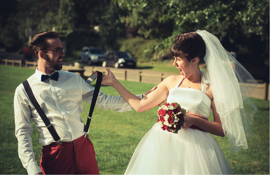
Image by Maréchal Crotmoul via Flickr
Some brides can pick a colour for their special day without a second thought. They may have a life-long love of pink, or their venue might have strong shaded that need to be coordinated with. Or, when she pictures her wedding day, she sees her bridesmaids awash in pastels. Sometimes, a bride has had her theme in mind for many years.
For others, it’s not as simple. But you can quickly pick the styles that get the heart racing as fast as your fiancé’s. Let’s take a look at some of the top colour scheme for your 2016 wedding reception.
Top Wedding Colours from Pantone
A wedding is one of the most important events in our life and deserves careful consideration on every detail, especially the reception colour scheme. Colours this year, and particularly for spring, are set to transport brides to a sunnier, happier place, where they will feel free to express the vivid versions of themselves.
- Pink is a classic shade used in many wedding decorations and is one of the top trending wedding colours for 2016. Rose Quartz, in particular, is set to be a trend. The calming, soothing nature of the colours this year are led by Rose Quartz – a rather persuasive yet gentle tone that tends to convey a sense of compassion and composure.
- A part of the orange family, Peach Echo is also set to be a trend this year. This tone emanates far friendlier qualities and evokes accessibility and warmth. Match the peach with gold and pink for a true touch of romance.
- Light blues can make every single part of the wedding day feel extra comfortable, just like the relaxing blue sky above us. Light blue is the perfect pastel colour palette to mix with peach.
- Maritime-inspired blues, such as Snorkel Blue, belongs to the navy family, but exudes a more energetic and happier context. Adding some neutral or chocolate shades can make for a seriously rustic and chic wedding theme at the Brighton Savoy in Melbourne.
- Shades of aqua suggest freshness and clarity and the modern, crisp influences evoke a very deliberate and mindful tranquillity.
- If you don’t like grey, try a Lilac Grey this year and mix with those gorgeous Rose Quartz accessories.
- As for a neutral colour scheme, try Iced Coffee which can work well with just about any colour, particularly green for a naturistic theme.
Be Sure to Adjust for Season and Geography
Once you have unearthed your personal style, start looking outwards. If you have your heart set on a strong seasonal feel for the fall time, pick a rustic palette. Make sure you let geography play an important role in your colour choices. Tropical affairs in the sunshine are great showcases for the brightest shades, like orchid and coral, orange and aqua.
Flowers will also play an important role in your colour choices. For instance, a profusion of pinks in a rose bouquet along with peonies is quintessentially English. Chrysanthemums and mini-sunflowers are more New England country.
Whatever you choose, this year’s colour palette is sure to suite all sorts of tastes and requirements.
Keep up with Project Fairytale


