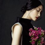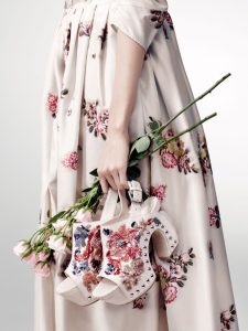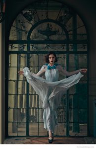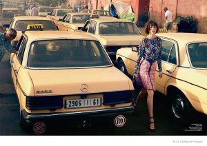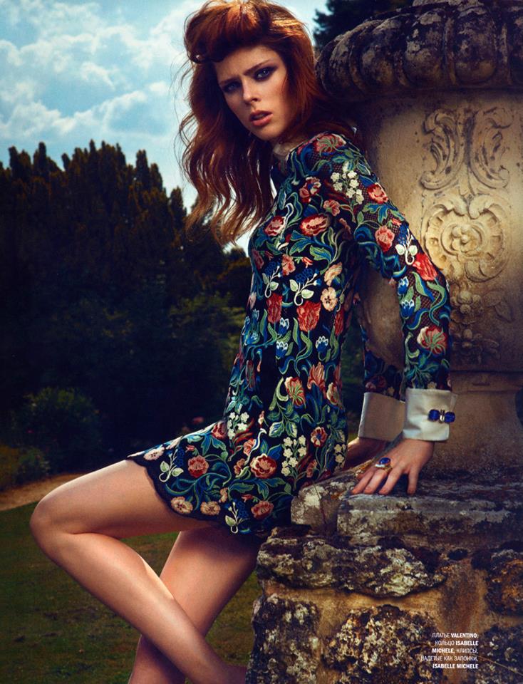
When looking at fashion editorials, collections and any other fashion related visuals, I am drawn towards the muted images, that never scream too loud and do not stand in your face in the most obvious way. I am not necessarily talking about those soft colored, hazy images in nude, pink and other pastels, but more about the general feel the image gives you. I like color, print and texture, but usually separately. In this editorial for L’Officiel Russia, Coco Rocha wears bold colors, loud prints and a lot of juxtaposed textures and I like it. I do not know why, maybe because of the soft afternoon light, that gives the photos a certain casuality or the scenery or the model herself… Still, loved every image <3.
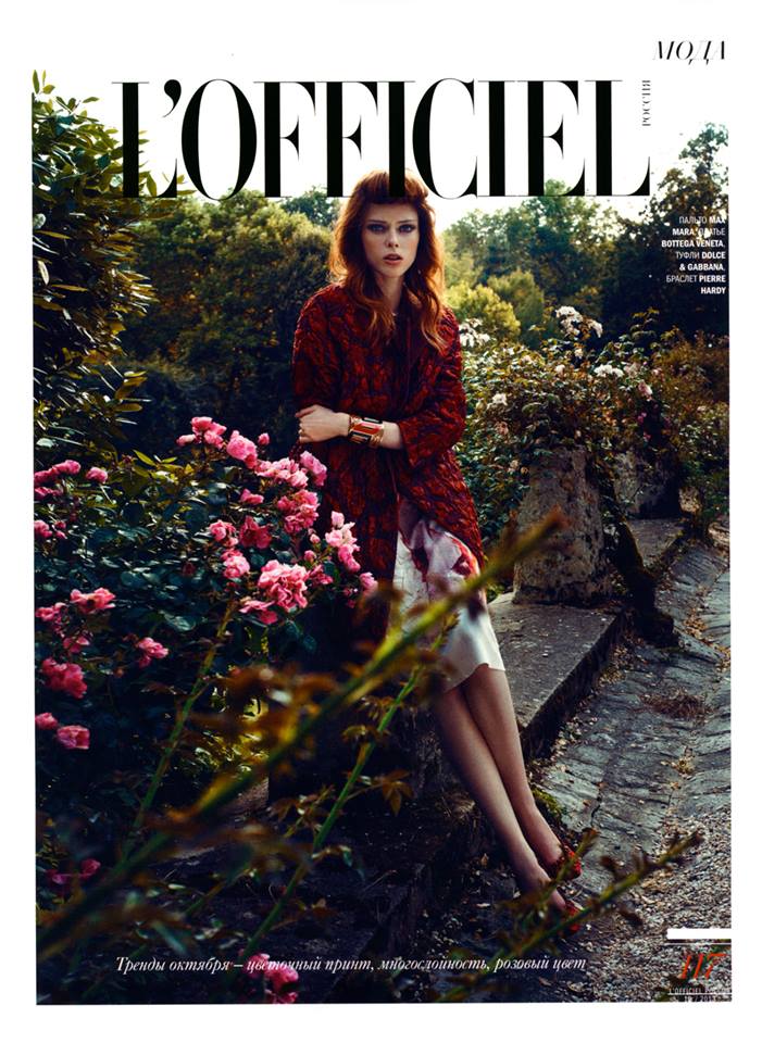
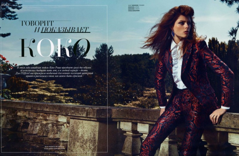
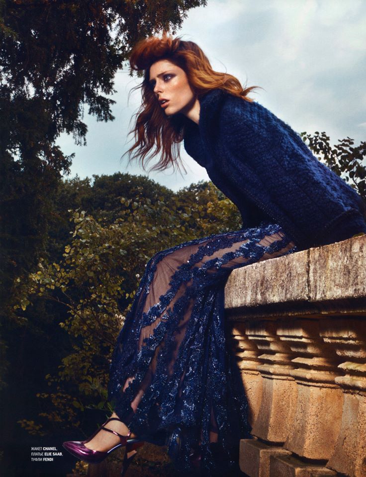
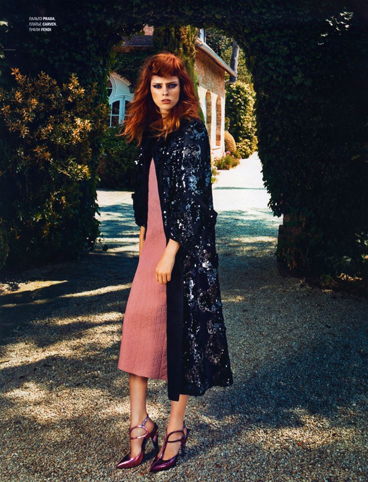
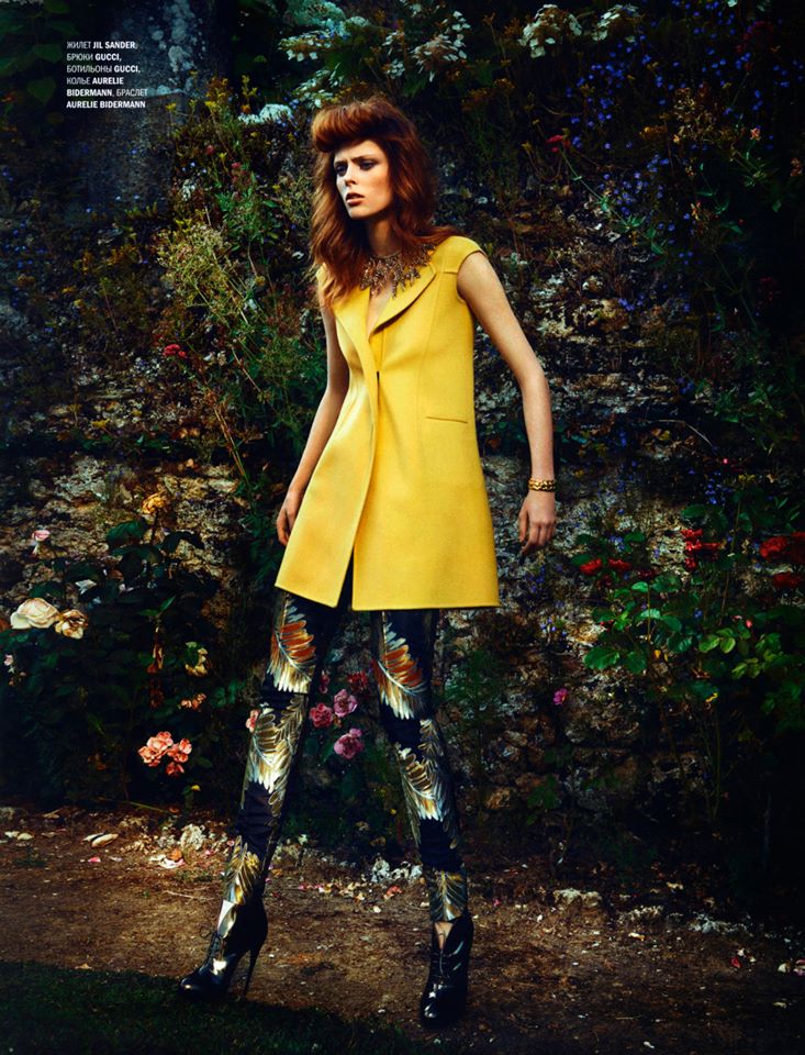
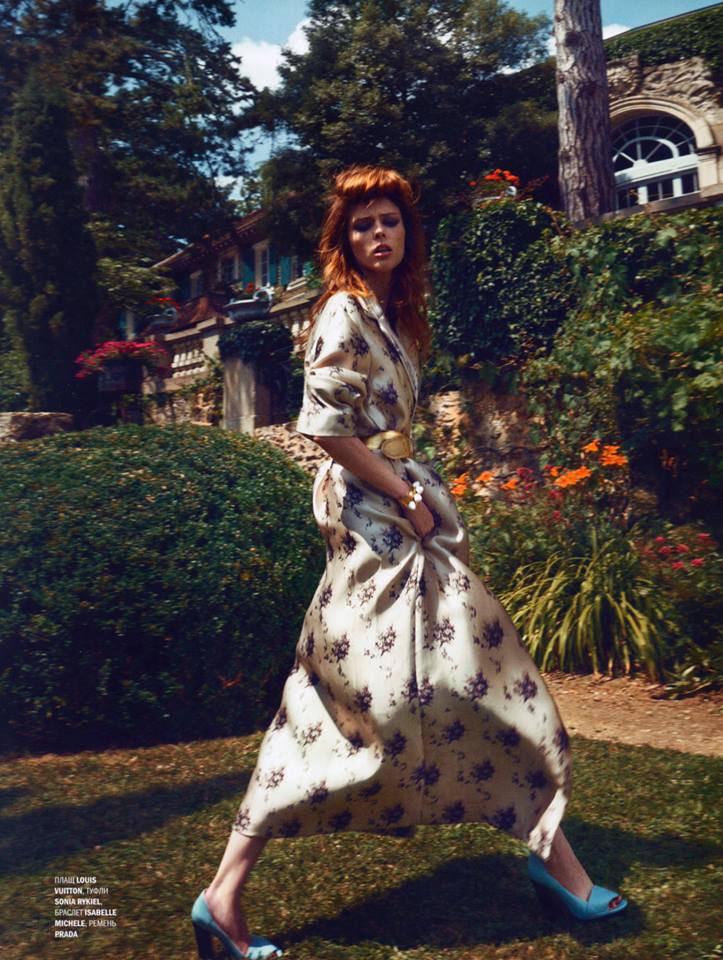
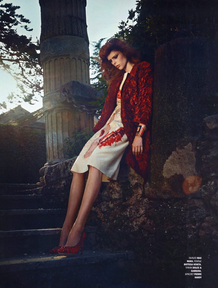
Coco Rocha for L’Officiel Russia October 2013
Keep up with Project Fairytale
Facebook / Pinterest / Twitter
